
 May 28, 2026
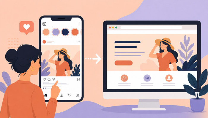
Social media attention is short-lived. Someone taps your profile, clicks your link, and decides within seconds whether they’ll stay or leave. That’s why creating a smooth transition from your social content to your website matters more than most brands realize.
When users move from Instagram to a website experience that feels disconnected, confusing, or visually inconsistent, trust disappears quickly. A polished transition keeps people engaged, increases conversions, and makes your brand feel more professional from the very first interaction.
In this guide, we’ll break down how to build a seamless visual experience that carries users naturally from social content to your website destination without friction.
Why Visual Consistency Matters More Than Ever
People process visuals faster than text. Before visitors read your headline or offer, they subconsciously judge whether your page feels familiar and trustworthy.
If your social profile uses soft neutral colors, modern typography, and clean product imagery, but your website suddenly switches to loud graphics and cluttered layouts, the disconnect creates hesitation.
Strong visual continuity helps users feel like they’re still interacting with the same brand. That sense of familiarity improves engagement and keeps attention focused on your offer rather than the design inconsistencies.
A cohesive experience also improves performance metrics like bounce rate, session duration, and conversion rates.
Start With a Clear Brand Identity
Before optimizing transitions, define the visual elements that make your brand recognizable.
This includes:
- Typography styles
- Brand colors
- Image editing style
- Button design
- Layout spacing
- Graphic treatments
- Tone of voice
Your social content and website should feel like they belong to the same ecosystem.
Brands that invest in consistent creative systems often see stronger conversion performance because users recognize the brand immediately across multiple touchpoints.
Many businesses that focus on unlimited web design services prioritize consistency frameworks specifically to improve customer trust across digital platforms.
Match the Look and Feel of Your Social Content
Your website should visually continue the experience users saw in your posts, stories, or ads.
Use Similar Color Palettes
Keep the same dominant colors visible on your destination page. Even subtle continuity helps reinforce recognition.
For example:
- If your content uses warm beige and muted black tones, maintain those accents on the page.
- If your feed relies on high-contrast modern styling, avoid switching to overly corporate layouts.
Consistency creates comfort.
Keep Typography Familiar
Fonts communicate personality instantly.
If your social graphics use elegant serif fonts or bold modern sans-serif typography, continue that same style throughout your website.
Avoid introducing completely different font combinations after the click.
Continue the Same Image Style
Photography style matters more than many brands think.
If your content uses:
- Bright lifestyle photography
- Dark cinematic edits
- Minimal product shots
- Flat illustrations
…then your website should continue the same aesthetic direction.
The smoother the visual transition, the lower the cognitive friction. Brands that consistently improve engagement often apply proven UI/UX secrets to create experiences that feel intuitive from the very first interaction
.
Make the First Screen Instantly Recognizable
The top section of your page should reassure visitors they landed in the right place.
This means the headline, imagery, and visual tone should immediately connect to the content that drove the click.
If someone clicked after seeing a modern fashion campaign, the destination should not feel like a generic corporate homepage.
The first few seconds determine whether users continue scrolling or leave.
Align Messaging With User Expectations
Consistency isn’t only visual. Messaging must align too.
If your social content promises:
- A discount
- A free guide
- Exclusive access
- A product launch
…then the next page should reinforce that exact promise immediately.
Avoid forcing users to search for the information they expected to see.
Reduce Friction in the User Journey
The smoother the path, the higher the likelihood of conversion.
A strong experience removes unnecessary decisions and distractions.
Keep Navigation Simple
Avoid overwhelming visitors with:
- Too many menu options
- Excessive popups
- Complicated layouts
- Unclear calls to action
Minimal interfaces often convert better because they maintain focus.
Design for Mobile First
Most users arriving from social media are on mobile devices.
Your pages should load quickly, scroll smoothly, and feel effortless to interact with on smaller screens.
Buttons should be easy to tap, text should remain readable, and spacing should feel comfortable.
This is especially important for an Instagram landing page because mobile usability directly impacts conversions.
Use Visual Hierarchy to Guide Attention
Good design naturally tells users where to look first.
Strategic visual hierarchy improves readability and makes actions feel intuitive.
Prioritize One Main Action
Every page should have a clear goal:
- Buy a product
- Book a consultation
- Join a waitlist
- Download a guide
Avoid competing calls to action that divide attention.
Use Contrast Carefully
Contrast helps important elements stand out.
Use it intentionally for:
- Buttons
- Headlines
- Key offers
- Important sections
Too much contrast everywhere creates visual chaos.
Understanding the psychology behind clicks can help brands structure layouts that naturally guide user behavior without overwhelming visitors.
Keep Content Flowing Naturally
The experience should feel progressive, not fragmented.
Each section should smoothly lead visitors toward the next action.
Avoid Abrupt Design Changes
Sudden shifts in:
- Background colors
- Typography
- Layout styles
- Content tone
…can interrupt the experience and create uncertainty.
Instead, maintain rhythm and consistency throughout the page.
Use White Space Strategically
Clean spacing improves comprehension and makes designs feel more premium.
Crowded layouts increase cognitive load and often reduce conversion performance.
Simple spacing adjustments can dramatically improve readability.
Build Strong Connections Between Ads and Pages
Visual alignment becomes even more important when running paid campaigns.
When users click on Instagram ads, they expect immediate continuity.
If the page feels unrelated to the advertisement, trust drops instantly.
Match Creative Assets
Whenever possible:
- Use the same imagery
- Repeat visual motifs
- Continue similar color treatments
- Maintain headline themes
The transition should feel intentional.
Reinforce the Original Offer
If your ad promotes:
- Free shipping
- Limited-time pricing
- A downloadable resource
…the destination page should highlight that same offer immediately.
Brands creating high-converting campaigns often rely on strategies similar to those used in smarter ppc landing pages to reduce disconnect between advertising and post-click experiences.
Improve Loading Speed for Better Retention
A visually beautiful page still fails if it loads slowly.
Users arriving from social platforms expect speed.
Optimize Images Properly
Large image files are one of the biggest causes of slow websites.
Compress images without sacrificing quality.
Use:
- WebP formats
- Lazy loading
- Proper sizing
This helps maintain performance while preserving aesthetics.
Remove Unnecessary Elements
Too many animations, scripts, or third-party widgets can slow pages down significantly.
Keep the experience clean and lightweight.
Create Scroll-Friendly Layouts
Modern users skim before they commit.
Your layout should encourage scrolling naturally.
Break Up Content Visually
Use:
- Short paragraphs
- Clear headings
- Image sections
- Bullet points
This improves readability and keeps users engaged longer.
Keep Calls to Action Visible
Users shouldn’t have to search for the next step.
Repeat your primary action naturally throughout the page without making it feel repetitive.
Test the Entire Experience Regularly
The best-performing pages evolve through testing.
Even small changes can improve results significantly.
Review the Full Journey
Check:
- Social post visuals
- Bio links
- Ad creatives
- Mobile responsiveness
- Page loading speed
- Conversion flow
Everything should feel connected.
Monitor User Behavior
Analytics can reveal where users lose interest.
Pay attention to:
- Bounce rates
- Scroll depth
- Click behavior
- Conversion drop-offs
These insights help refine the experience over time.
Teams comparing creative workflows sometimes evaluate tools like canva vs figma to streamline collaboration and maintain stronger design consistency across marketing assets.
Small Design Details Create Big Results
Many businesses focus heavily on attracting clicks but overlook the experience after the click.
That’s where conversions are won or lost.
A smooth visual flow creates trust, improves clarity, and keeps users engaged long enough to take action.
The goal isn’t simply to make pages look attractive. It’s to create continuity that feels effortless to the user.
When your social content and website experience feel unified, your brand instantly appears more polished, credible, and conversion-focused.
That consistency can make a significant difference in long-term marketing performance.
FAQs
Why is visual consistency important between social media and websites?
It helps users trust the brand faster and reduces confusion during the transition.
How can I improve conversions from social traffic?
Use matching visuals, clear messaging, and fast mobile-friendly pages.
What makes a good landing page design?
Clean layouts, strong hierarchy, clear calls to action, and visual consistency.
Why do users leave pages quickly after clicking ads?
Slow loading speeds, inconsistent design, and unclear messaging often cause drop-offs.
How do I make my website feel connected to my social content?
Use consistent colors, typography, imagery, and messaging across both platforms.