
 November 4, 2024
Creating a powerful landing page is crucial for capturing your audience’s attention and driving conversions. A well-designed landing page serves as the first impression for your visitors, guiding them towards taking a specific action, whether it’s signing up for a newsletter, purchasing a product, or downloading a resource. In this article, we’ll walk through everything you need to know about designing a landing page that not only grabs attention but also converts effectively. From understanding layout basics to optimizing for SEO, you’ll find actionable tips to get started.
What is a Landing Page?
A landing page is a web page specifically created to prompt a visitor to take a specific action, such as filling out a form, signing up for a free trial, or downloading a resource. It’s often used in conjunction with marketing campaigns, directing traffic from ads, email links, or social media posts to a targeted destination.
Why is it Different from Other Web Pages?
Unlike standard web pages, which provide multiple navigation paths, a landing page minimizes distractions. It typically has limited navigation, focusing entirely on the primary conversion goal. This focus increases the chances of visitors completing the desired action.
Identifying Your Landing Page Goal
Defining the Purpose
Before diving into design, define what you want your visitors to accomplish on this page. Are you looking to gather email addresses, drive sales, or promote a webinar? Clear goals will help shape the page’s design, messaging, and call-to-action.
Setting Up Conversion Goals
Conversion goals can be anything measurable, such as a purchase, download, or sign-up. By defining these objectives, you can monitor performance and refine the design for better results.
Choosing the Right Layout and Structure
Importance of a Simple and Clean Design
A clutter-free, clean layout ensures that your message is clear and keeps visitors focused. Opt for whitespace, simple fonts, and minimal distractions to guide users toward the CTA. For more inspiration on achieving a clean design, check out these top trends in web design.
Arranging Elements for Maximum Impact
Placing critical elements like your CTA, headline, and form above the fold ensures they are easily visible without scrolling. Proper placement of these elements can significantly impact conversions.
Crafting a Compelling Headline
The headline is the first thing visitors see, so it needs to grab attention immediately. A compelling headline should communicate the value of the offer in a few words.
Writing Attention-Grabbing Headlines
Use powerful, action-oriented language that speaks directly to the visitor’s needs. Your headline should address a problem, highlight a benefit, or create curiosity.
Examples of Effective Landing Page Headlines
Some effective headline examples include:
- “Double Your Leads in 30 Days with Our Proven System”
- “Discover the Secret to Healthier Skin – Try Our Free Sample Today”
Using Subheadings to Maintain Interest
Subheadings help break down information into digestible chunks, guiding readers down the page and reinforcing the value proposition.
How Subheadings Keep Visitors Engaged
Subheadings should work as mini-headlines, maintaining interest and leading the visitor further toward the CTA.
Creating Subheadings that Convert
Focus on making subheadings informative and persuasive. They should highlight additional benefits or address common concerns.
Writing Persuasive and Concise Copy
Best Practices for Landing Page Copy
Your copy should be concise and to the point, clearly communicating the benefits of your offer without overwhelming visitors with details.
Avoiding Common Copywriting Mistakes
Avoid jargon and complex language. Instead, speak directly to your audience, using simple, benefit-driven language that makes it easy for them to say “yes.”
Including a Strong Call-to-Action (CTA)
The CTA is the most crucial part of your landing page. It’s what prompts visitors to take action.
How to Write a CTA That Converts
Use action-oriented phrases that motivate, such as “Get Started Now” or “Claim Your Free Trial.” Make it clear what they will gain by clicking the button.
CTA Button Placement and Design
Your CTA button should stand out, using contrasting colors and prominent placement. Experiment with different placements to find what works best for your audience.
Visual Elements: Images, Videos, and Graphics
Visuals are powerful tools for engaging visitors. They can quickly convey your message and enhance the overall experience.
Choosing Relevant and High-Quality Images
Use images that align with your brand and the offer on the landing page. Avoid generic stock photos; instead, opt for original or brand-specific visuals.
Incorporating Video to Boost Engagement
Videos are known to increase engagement and conversions. Adding a short, informative video can make your landing page more interactive and compelling.
Optimizing for Mobile Users
With more users accessing sites on mobile devices, ensuring your landing page is mobile-friendly is essential.
Ensuring a Mobile-Friendly Layout
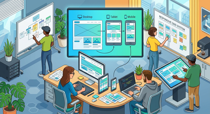
Use responsive design to adapt the layout for different screen sizes. Test your page on various devices to ensure optimal performance.
Avoiding Mobile Design Pitfalls
Limit the use of pop-ups and long forms, as they can hinder mobile users. Keeping your page fast and accessible will increase mobile conversions.
Leveraging Social Proof
Social proof, like testimonials and reviews, builds trust and reassures visitors that your offer is valuable.
Testimonials, Reviews, and Case Studies
Including real customer feedback can make your page more credible and increase conversions.
Why Social Proof Builds Trust
Positive reviews or case studies demonstrate that others have benefited from your offer, which can sway undecided visitors to convert.
Using Forms Efficiently
Forms should be simple and easy to complete. Longer forms can deter visitors, so only ask for essential information.
Simplifying Form Fields
Use as few fields as possible to increase submission rates.
Placement and Design of Forms
The form should be placed prominently, making it easy for visitors to complete without scrolling.
Loading Speed and Performance
A slow-loading page can cost you conversions. Make sure your landing page is optimized for fast loading.
How Page Load Speed Affects Conversions
Studies show that a delay of even a few seconds can result in higher bounce rates and lost conversions.
Tips to Improve Loading Time
Optimize images, reduce scripts, and use a content delivery network (CDN) to improve load times.
SEO Optimization for Landing Pages
Optimizing your landing page for search engines can help increase organic traffic.
Keywords, Meta Descriptions, and Alt Text
Use targeted keywords in your headings, meta descriptions, and image alt text to make your page more visible.
Using SEO Techniques to Increase Visibility
SEO-friendly URLs, high-quality content, and fast load times can all contribute to better search rankings.
Common Landing Page Mistakes to Avoid
Avoiding certain mistakes can greatly improve the effectiveness of your landing page.
Avoiding Design Pitfalls
Ensure your design isn’t cluttered or confusing. Avoid excessive text or unnecessary elements.
Checking for Usability Issues
Test your landing page to ensure it’s easy to navigate and that all elements function properly.
Conclusion
A well-designed landing page is a vital part of any digital marketing strategy. By focusing on clarity, simplicity, and persuasion, you can create a page that not only captures attention but also drives conversions. Remember, a successful landing page should be continually tested and refined to maximize results.