
 July 3, 2026
Minimalism has long been associated with black-and-white layouts and restrained visuals, but today’s designers are proving that simplicity doesn’t have to be colorless. By combining clean compositions with carefully chosen hues, minimalist graphic design creates visuals that feel modern, memorable, and full of personality without becoming overwhelming.
From branding and social media graphics to websites and packaging, color has become an essential tool for adding emotion and depth while preserving the clarity that defines minimalism. Whether you’re a designer seeking inspiration or a business looking to refresh your visual identity, these examples demonstrate how strategic color choices can make a lasting impression.
Why Color Works in Minimalist Graphic Design
The strength of minimalist graphic design lies in removing distractions so every visual element serves a purpose. Introducing color doesn’t change that philosophy—it enhances it. A single accent color, a carefully balanced palette, or a bold background can guide attention, reinforce brand identity, and improve the overall user experience.
Many businesses also discover that pairing thoughtful visuals with graphics design services creates stronger brand recognition across digital and print marketing materials.
1. Bright Accent Colors on Neutral Backgrounds
One of the easiest ways to make minimalist graphic design stand out is by placing a vibrant accent color against a white, cream, or light gray background. The contrast naturally draws attention without making the composition feel cluttered.
This technique works particularly well for landing pages, product highlights, and promotional banners because the eye is immediately guided toward the most important content.
Businesses investing in consistent branding often combine this approach with professional unlimited web design services to maintain a cohesive appearance across every page of their website.
2. Monochromatic Color Variations
A monochromatic approach uses multiple shades of the same color to create depth while maintaining simplicity. Instead of introducing several competing colors, designers rely on lighter and darker tones to establish hierarchy.
This style is a perfect example of minimalist graphic design because it keeps layouts clean while adding enough variation to avoid a flat appearance. It’s especially effective for dashboards, mobile interfaces, and corporate presentations where readability matters.
3. Bold Geometric Shapes
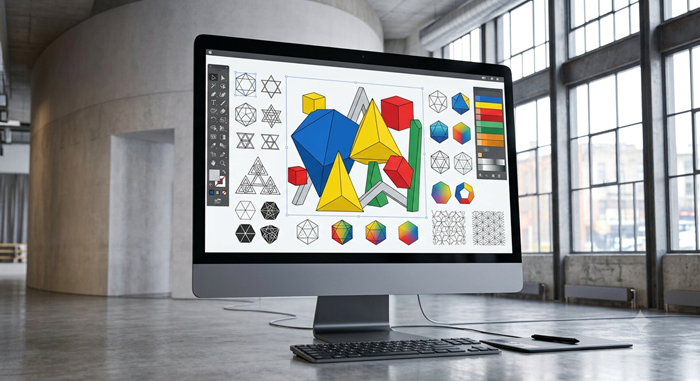
Simple circles, rectangles, and abstract forms become much more engaging when paired with confident colors. This approach embraces bold minimalism, allowing large blocks of color to create visual balance without unnecessary decoration.
Geometric layouts also make information easier to scan, making them popular for posters, advertisements, and digital campaigns. The design feels energetic while remaining organized and easy to understand.
4. Limited Color Palettes with Strong Contrast
Rather than using every available color, successful designers intentionally restrict their palette. Carefully selected minimalist color palettes create consistency across every visual asset while helping audiences recognize a brand more quickly.
Choosing the right colors is about more than aesthetics. Understanding color psychology in marketing can help businesses select colors that reinforce trust, excitement, or sophistication depending on their goals.
This balance between simplicity and strategy is another reason minimalist graphic design continues to remain relevant across industries.
5. Colorful Typography as the Main Visual
Typography doesn’t always have to play a supporting role. In many modern compositions, oversized colorful lettering becomes the centerpiece while everything else stays intentionally restrained.
This technique reflects the evolving minimalist graphic design style, where designers replace decorative illustrations with expressive typography that communicates both information and personality.
Large headlines combined with generous whitespace create a polished appearance that’s equally effective for editorial layouts, event promotions, and website hero sections.
As businesses expand their visual identity across multiple channels, many also explore web and graphics design solutions that keep branding consistent from websites to social media and marketing materials.
6. Minimal Illustrations with Vibrant Backgrounds
A simple illustration can become far more impactful when placed on a bold, colorful background. Instead of filling the canvas with decorative details, designers let one illustration become the focal point while color creates visual energy.
This approach is widely used in editorial graphics, startup branding, and digital advertising because it communicates ideas quickly without sacrificing elegance. It’s another reason minimalist graphic design remains a timeless choice for modern brands.
Many businesses looking for consistent creative support also benefit from an unlimited graphic design service that delivers scalable design solutions without the limitations of traditional project-based pricing.
7. Abstract Shapes with Purpose
Abstract forms don’t need to be complicated to leave a lasting impression. Soft curves, flowing lines, and overlapping circles can communicate movement and creativity while maintaining a clean layout.
These compositions often resemble bold minimalist art, proving that simple shapes combined with intentional color choices can evoke emotion just as effectively as detailed illustrations. When every element has a purpose, the overall design feels polished instead of empty.
This thoughtful use of space is one of the defining qualities of minimalist graphic design.
8. Color Blocking for Visual Hierarchy
Color blocking is an effective way to separate information while preserving a simple structure. Large sections of contrasting color naturally guide readers through a layout without relying on heavy borders or decorative elements.
Whether used in presentations, websites, or marketing materials, this technique improves readability and keeps important messages organized. It’s also one of the most practical minimalist graphic examples designers can adapt across different industries.
Businesses comparing website designer cost should also consider how thoughtful design systems improve long-term consistency rather than focusing only on the initial investment.
9. Icons That Add Personality
Icons are often overlooked, yet they play a significant role in creating engaging user experiences. Simple, colorful icons make interfaces feel approachable while helping users navigate content more efficiently.
Rather than using complex illustrations, designers rely on clean icon sets with consistent proportions and carefully selected colors. This subtle approach strengthens minimalist graphic design without introducing unnecessary visual noise.
A professional graphics design agency often develops custom icon systems to ensure every digital touchpoint feels cohesive and instantly recognizable.
10. White Space That Lets Color Shine
White space isn’t empty space—it’s an essential design tool. By giving colorful elements room to breathe, designers create layouts that feel balanced, premium, and easy to understand.
Many of today’s most recognizable brands rely on generous spacing combined with strategic color placement to build memorable visual identities. Modern trends like Neo-Minimalism graphics demonstrate how simplicity continues to evolve while embracing expressive colors and refined compositions.
Ultimately, minimalist graphic design succeeds because it prioritizes clarity over complexity, allowing every color choice to serve a meaningful purpose.
Conclusion
Minimalism has never been about removing color—it has always been about removing distractions. These ten examples show how thoughtful color choices can transform simple layouts into memorable visual experiences that communicate clearly and effectively.
Whether you’re designing a website, creating social media content, or developing a complete brand identity, minimalist graphic design offers the flexibility to stay modern without feeling repetitive. By focusing on balance, intentional color use, and clean composition, designers can produce work that remains timeless while standing out in crowded digital spaces.
The best results come from experimentation. Try different palettes, simplify unnecessary elements, and allow color to support your message instead of competing with it. That’s what makes minimalist graphic design one of the most effective design approaches today.
Frequently Asked Questions
1. What is minimalist graphic design?
It is a design approach that uses only essential visual elements to communicate a message clearly.
2. Can minimalist designs include bright colors?
Yes, strategic use of color enhances visual impact while maintaining simplicity.
3. Why is white space important in minimalist design?
White space improves readability and helps important elements stand out.
4. Where is minimalist graphic design commonly used?
It’s widely used for branding, websites, social media, packaging, and marketing materials.
5. How do I create an effective minimalist design?
Focus on clear layouts, limited colors, purposeful typography, and removing unnecessary elements.