
 August 19, 2026
Logo design is changing quickly as brands compete across websites, mobile apps, social feeds, packaging, and AI-powered interfaces. The strongest identities are not simply following current logo trends; they are choosing visual ideas that make a brand easier to recognize and more relevant across different contexts. The previous version of this article focused on 2025, when adaptive marks, bold typography, subtle depth, retro influences, and simpler forms were gaining ground. This update moves the conversation into 2026, with a stronger focus on flexibility, distinctive typography, responsive systems, and purposeful simplicity.
Key Takeaway:
- Flexible identity systems are more useful than rigid, one-size-fits-all marks.
- Strong typography and distinctive shapes help brands stay recognizable.
- AI can speed exploration, but strategy and originality still matter.
- The right direction should fit the brand rather than copy a fashionable style.
What Are the Biggest Logo Trends in 2026?
The most useful logo trends are less about one particular shape or color and more about how an identity behaves. Brands now need marks that can work as a tiny social avatar, a website header, an app icon, a printed package, and sometimes an animated element.
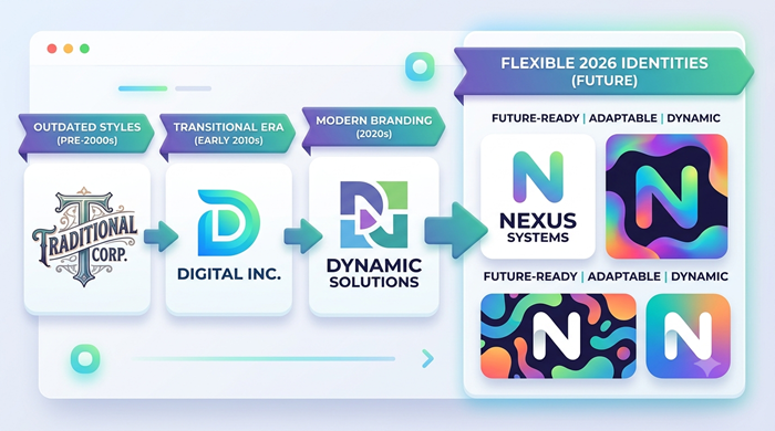
That shift is pushing designers toward systems rather than single, rigid symbols. A strong identity may include a primary mark, a simplified small-size version, a wordmark, a monochrome option, and rules for motion or digital use.
1. Responsive and Adaptive Logo Systems
Responsive branding is moving from a nice-to-have feature to a practical requirement. A detailed logo that looks excellent on a billboard may become unreadable when reduced to a small mobile icon.
One of the most useful logo trends is therefore designing several coordinated versions from the beginning. The core identity stays recognizable while unnecessary detail disappears at smaller sizes.
This approach also helps brands maintain consistency across websites, social platforms, email signatures, merchandise, and printed materials. Instead of forcing one artwork into every situation, designers build a flexible visual system.
2. Typography Is Taking Center Stage
Typography-led identities are becoming more distinctive because brands want to communicate personality without depending on a generic symbol. Custom lettering, carefully modified typefaces, and unusual spacing can make a wordmark instantly recognizable.
Understanding typographic design is especially useful here because letterforms influence tone, hierarchy, readability, and brand personality. A sophisticated type treatment can make a simple name feel premium, playful, technical, or approachable.
In 2026, logo trends are increasingly favoring typography that feels ownable rather than decorative. The goal is not to pick the strangest font available. It is to create a visual voice that customers can associate with one brand.
3. Simplified Shapes With More Personality
Minimalism is still relevant, but the safest interpretation of minimalism is no longer enough. Brands are looking for simple forms with a distinctive twist: an unexpected cut, custom proportion, clever negative space, or memorable silhouette.
This is one reason logo trends are moving away from generic geometric marks. A simple logo can be powerful, but simplicity needs to support recognition rather than remove character.
If you are exploring restrained visual styles, reviewing 10 minimalist graphic design examples with color shades can help you see how spacing, contrast, and color can add personality without creating clutter.
4. Controlled Color and Subtle Dimension
Color is becoming more intentional. Rather than covering a mark in multiple effects, designers are using carefully selected palettes, soft gradients, contrast shifts, and secondary colors that support the wider brand system.
Subtle dimension can also add depth without making a logo feel heavy. The key is restraint. A gradient should improve recognition or create a useful digital variation, not exist simply because software makes effects easy to apply.
Among emerging logo trends, this controlled approach represents a shift from decorative effects toward visual systems with a clear purpose.
This is a clear evolution from the previous article, which highlighted gradients and dimensional details as emerging directions. The bigger lesson for 2026 is that effects work best when they serve a strategic purpose.
5. Motion-Ready Identities
Digital brands increasingly need identities that can move. A mark might animate during a website load, transform into a social video opener, or respond to interaction inside an app.
Motion should not be treated as an afterthought. A good logo system can define how the mark appears, transforms, scales, or transitions while remaining recognizable.
Among the strongest logo trends, motion-ready design stands out because it connects branding with the way audiences actually experience digital products. The static logo remains essential, but motion can add another layer of recognition.
6. AI-Assisted Exploration, Human-Led Direction
AI is changing the speed of design exploration. It can help teams generate references, test visual directions, compare variations, and explore combinations that might otherwise take longer to develop.
However, fast generation does not automatically create a strong brand identity. Designers still need to judge originality, legibility, cultural context, trademark risk, scalability, and long-term relevance.
One of the notable logo trends for 2026 is therefore not simply AI-generated artwork, but AI-assisted exploration followed by human refinement and strategic decision-making.
For teams managing repeated creative needs, an unlimited graphic design subscription can provide a structured way to explore concepts and refine brand assets without treating every design task as a completely separate project.
What’s Out in 2026?
Knowing what is fading is just as useful as knowing what is gaining attention. Some logo trends may look attractive in isolation but create problems when they are overused or disconnected from a brand’s actual needs.
Overly Detailed Logos
Tiny details, complex illustrations, and crowded compositions can disappear at smaller sizes. If customers cannot identify a mark quickly, visual complexity becomes a liability.
Generic Symbols
Globe icons, predictable swooshes, generic lightbulbs, and overused abstract shapes make differentiation difficult. A brand mark should communicate something ownable, even when the concept itself is simple.
Trend-Chasing Typography
A fashionable typeface can make a new identity look current today and dated tomorrow. Stronger brands choose typography based on personality, readability, and distinctiveness rather than short-term popularity.
Excessive Visual Effects
Heavy shadows, loud neon effects, unnecessary bevels, and complicated gradients can distract from the core mark. Digital tools make effects easy, but accessibility and recognition should remain more important than novelty.
Rigid One-Logo Systems
A single artwork that must work identically everywhere is becoming less practical. Modern brands need flexibility without losing consistency, especially as the number of digital touchpoints continues to grow.
How to Choose the Right Direction for Your Brand
Following logo trends should never become the main goal of a rebrand. Before approving a new concept, start with the brand itself.
Ask what the company stands for, who it needs to attract, where the identity will appear, and what competitors already look like. These answers create a useful filter for design decisions.
Next, test the concept in real situations. View it as a website header, mobile icon, social profile image, printed document, product label, and monochrome graphic. If the identity works only in a presentation mockup, it is not ready.
A professional logo maker can help with early concepts, but business owners should evaluate the thinking behind each option instead of choosing the most visually impressive first draft.
It is also worth considering the tools used to build and manage the identity. The right graphic design software for business should support vector editing, file exports, collaboration, version control, and efficient adaptation across different formats.
Canva vs Figma: Which Workflow Fits Logo Development?
The choice of tools depends on the stage of the project. Canva can be useful for quick brand applications and simple collaborative content, while Figma offers a stronger environment for structured interface work, component systems, and collaborative design workflows.
If your team is comparing canva vs figma, focus less on which platform is universally better and more on the type of work you need to complete. Logo creation often requires precision and vector-focused tools, while broader brand rollout may involve several platforms.
The important point is that the software should support the identity rather than dictate it. A well-developed concept can be adapted across tools when the underlying design system is clear.
How Much Should You Invest in a Logo?
Budget depends on the scope of the project, the experience of the designer, research involved, number of concepts, revisions, and the brand assets included in the final package.
So, how much does a professional logo cost? There is no single universal price. A simple mark may require less work than a complete identity system that includes typography, color rules, responsive versions, social assets, and brand guidelines.
The real question is whether the final identity can support the business for years. A cheap logo that needs to be replaced quickly can cost more in the long run than a well-planned identity created with scalability in mind.
When to Hire a Professional
DIY tools are useful for experimentation, especially for new businesses testing an idea. But a growing brand may need deeper research, stronger differentiation, and a system that works across many applications.
Professional logos are usually built with attention to proportion, spacing, legibility, file formats, color behavior, and practical usage. Those details become especially important when the mark appears in dozens of places.
A professional logos design approach should also connect the visual mark with typography, color, supporting graphics, and practical usage rules. For companies that need this broader expertise, professional logo design services can help create a cohesive identity instead of treating the logo as an isolated image.
For businesses that need broader digital support, unlimited web design can help carry the refreshed branding into the website where customers experience it.
What Makes a Logo Feel Professional?
A strong identity does not have to be complicated. It should be recognizable, appropriate for the audience, technically clean, and flexible enough to survive different applications.
A good logo also has a clear reason behind its visual choices. The colors, forms, lettering, and proportions should support the brand rather than exist only to follow a fashionable look.
The phrase logos definition can be understood simply as visual identifiers that help audiences recognize a brand, organization, product, or service. The most memorable marks build recognition through consistent use and a strong connection with the wider brand experience.
How to Future-Proof Your Logo
The smartest logo trends are the ones that solve practical problems. Before committing to a redesign, build a small testing checklist.
First, check recognition at different sizes. Then test black and white versions, light and dark backgrounds, print applications, mobile screens, and social profiles.
Next, compare the concept with competitors. A mark can be attractive and still be too similar to others in the same market. Distinctiveness should be evaluated early, not after launch.
Finally, create basic usage rules. Define minimum size, clear space, color variations, background behavior, and which version should be used in different contexts. These rules protect the identity as more people begin using it.
The Future of Logo Design
The next phase of branding will likely combine simplicity with greater flexibility. Static marks will continue to matter, but responsive versions, custom typography, motion, and digital applications will become increasingly connected.
The best logo trends will therefore be less about chasing a visual style and more about building identities that can evolve without losing recognition. Brands that understand this distinction can modernize without constantly redesigning themselves.
A successful logo should feel relevant today while leaving enough room for tomorrow. That balance between familiarity and freshness is what turns a visual mark into a durable brand asset.
Conclusion
The strongest identities in 2026 are not necessarily the most complicated or the most fashionable. They are the ones that communicate clearly, work across platforms, and give the brand a recognizable visual voice.
Use logo trends as inspiration, not as a checklist. Start with your audience, positioning, and business goals, then choose the visual direction that strengthens those foundations.
The most effective logo trends are ultimately the ones that support recognition, usability, and long-term brand consistency. If you are refreshing an existing identity, compare what still works with what no longer represents the business. If you are launching a new brand, build flexibility into the system from the beginning.
FAQs
What are the biggest logo trends for 2026?
Responsive systems, distinctive typography, simplified shapes, purposeful color, and motion-ready identities are key directions.
Are minimalist logos still popular?
Yes, but current minimalism focuses on distinctive details and recognition rather than extreme simplicity.
Should every brand follow logo trends?
No, brands should use relevant trends selectively while protecting their own identity and long-term consistency.
Is AI suitable for logo design?
AI can accelerate exploration, but human strategy, originality, refinement, and validation remain essential.
When should a business redesign its logo?
A redesign makes sense when the existing identity no longer fits the brand, audience, digital applications, or business direction.