
 May 12, 2026
A landing page has one job: guide a visitor toward action without distraction. But high-performing pages don’t convert because they look attractive alone. They convert because they understand how people think, react, hesitate, and trust.
The psychology behind user behavior plays a major role in whether someone clicks a button, signs up for a service, or leaves the page within seconds. Every color choice, headline structure, spacing decision, and visual cue influences attention and decision-making.
That’s why the highest-converting brands focus less on decoration and more on behavioral design. They build experiences that reduce friction, create clarity, and guide visitors naturally toward a decision.
In this guide, we’ll break down the psychological principles that influence conversion-focused experiences and explain how modern businesses can create smarter, more persuasive landing pages without making them feel pushy or overwhelming.
Why Human Psychology Matters in Conversion Design
Most users don’t read a page word-for-word. They scan. They judge quickly. They form opinions within seconds.
People make emotional decisions first and logical decisions second. A visitor may believe they’re evaluating features or pricing rationally, but subconscious signals often determine whether they continue scrolling or exit the page.
This is why visual hierarchy, messaging flow, and emotional triggers matter so much in digital experiences.
Businesses investing in strong user experiences often combine strategy, messaging, and scalable web development services to build pages that feel intuitive from the first interaction.
The First Five Seconds Decide Everything
The brain processes visuals faster than text. Before a visitor reads a single sentence, they already notice layout balance, contrast, spacing, and visual organization.
If a page feels cluttered or confusing, trust drops instantly.
Clarity Reduces Cognitive Load
When users land on a page, they subconsciously ask:
- What is this?
- Is this relevant to me?
- What should I do next?
- Can I trust this brand?
If the design fails to answer those questions quickly, users leave.
Strong conversion-focused pages reduce cognitive load by simplifying decisions. They avoid unnecessary animations, excessive copy, and confusing navigation.
Simple experiences consistently outperform complicated ones because the brain naturally prefers clarity over effort.
Visual Hierarchy Shapes Attention
People don’t consume content randomly. Their eyes follow patterns.
Strategic hierarchy tells users where to look first, second, and third. This is one of the most important psychological elements in conversion optimization.
Headlines Should Create Immediate Relevance
A headline must instantly communicate value.
Weak headlines create uncertainty. Strong headlines create recognition and emotional alignment.
Visitors should immediately understand:
- What the offer is
- Who it’s for
- Why it matters
This is especially important when building landing pages for paid traffic campaigns where attention spans are extremely short.
Strategic Contrast Directs Focus
Contrast guides attention naturally.
Designers use size, spacing, typography, and color contrast to highlight the most important actions on a page. When everything competes for attention, nothing stands out.
A properly designed call to action button becomes visually dominant without feeling aggressive.
Emotional Triggers That Increase Conversions
Emotion is often the hidden force behind digital decisions.
People buy solutions that make them feel safer, smarter, faster, more successful, or more confident.
Effective pages tap into emotional motivation without sounding manipulative.
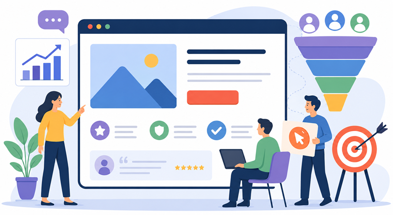
Trust Signals Reduce Anxiety
Every online interaction includes risk. Users worry about wasting time, losing money, or making poor decisions.
Trust-building elements reduce that hesitation.
Examples include:
- Testimonials
- Client logos
- Case studies
- Security indicators
- Real statistics
- Transparent messaging
The goal is simple: make users feel comfortable moving forward.
The Principle of Visual Simplicity
Minimalism isn’t just a design trend. It’s psychological optimization.
When pages contain too many choices, users experience decision fatigue. Too much information creates friction.
Cleaner layouts improve comprehension and increase engagement because the brain processes them faster.
Brands offering scalable creative solutions like unlimited web design often prioritize streamlined systems that maintain consistency without overwhelming users visually.
White Space Improves Readability
White space creates breathing room.
It separates sections, improves focus, and helps users absorb information more efficiently. Crowded layouts feel stressful, while open layouts feel easier to navigate.
The best landing pages rarely feel busy, even when they contain significant information.
The Power of Directional Cues
Users unconsciously follow visual guidance.
Directional cues can include:
- Arrows
- Eye direction in photos
- Layout flow
- Section spacing
- Motion indicators
- Button placement
These subtle signals help guide visitors toward important actions naturally.
Good design feels effortless because it quietly directs behavior without making users aware of it.
Why Consistency Builds Trust
Consistency creates familiarity, and familiarity increases confidence.
When colors, typography, messaging, and visuals remain aligned throughout a page, users feel more secure.
Inconsistent experiences create friction because the brain has to reprocess information repeatedly.
Consistency is particularly important in landing pages design where every section should reinforce the same message and emotional tone.
Messaging Alignment Matters
A major conversion mistake happens when ads, headlines, and page content feel disconnected.
If users click an ad promising one thing but arrive on a page communicating something different, trust drops immediately.
The experience should feel seamless from ad click to final conversion.
Color Psychology and User Action
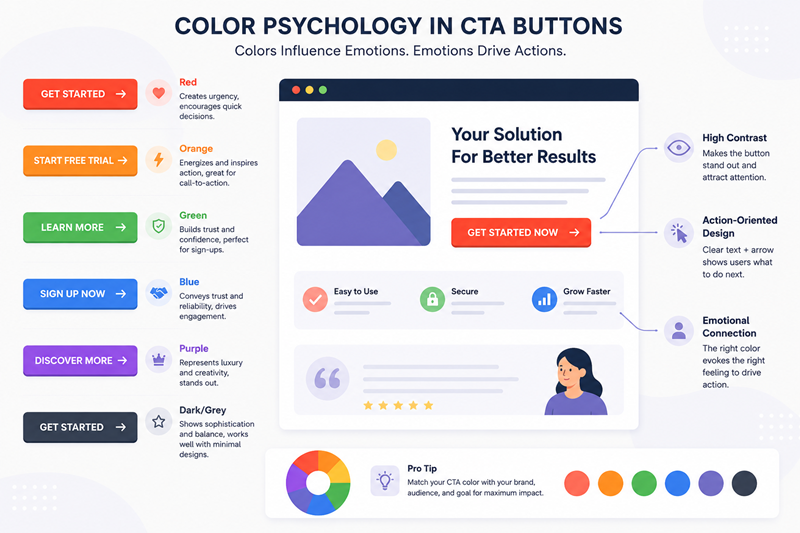
Colors influence emotional response more than many businesses realize.
Different shades can create feelings of urgency, calmness, trust, energy, or sophistication.
However, color psychology works best when used strategically rather than symbolically.
The key is contrast and visibility, not simply choosing trendy colors.
Buttons Should Feel Actionable
Buttons must stand out visually while remaining consistent with the page design.
Strong button design includes:
- Clear wording
- High contrast
- Adequate spacing
- Mobile-friendly sizing
- Predictable placement
Small improvements in button clarity often create measurable conversion increases.
Social Proof Creates Behavioral Validation
Humans naturally look to others when making decisions.
If people see others trusting a product or service, perceived risk decreases.
This psychological principle explains why reviews, testimonials, and customer numbers are so effective.
Real Experiences Matter More Than Generic Claims
Specificity increases credibility.
“Helped 3,000 businesses improve conversions” feels more believable than vague marketing promises.
Authentic customer stories outperform exaggerated promotional language because they feel relatable and trustworthy.
Urgency Works Best When It Feels Genuine
Urgency can motivate action, but fake urgency damages credibility.
Users are increasingly aware of manipulative tactics like endless countdown timers or false scarcity claims.
Effective urgency focuses on real value:
- Limited availability
- Time-sensitive offers
- Seasonal campaigns
- Early-access opportunities
The goal is to encourage decisions without creating distrust.
Mobile Psychology Is Different
Mobile users behave differently from desktop users.
They scroll faster, skim more aggressively, and expect immediate clarity.
This means mobile-first thinking is essential for seo for landing pages and conversion performance.
Thumb-Friendly Navigation Matters
Buttons, forms, and interactive elements should feel easy to use on smaller screens.
Friction increases dramatically when users struggle with:
- Tiny buttons
- Long forms
- Slow loading
- Poor spacing
- Difficult navigation
The easier the interaction feels, the higher the conversion potential.
The Role of Speed in User Behavior
Speed directly affects trust and engagement.
Slow-loading pages create frustration before users even engage with content.
Research consistently shows that even small delays reduce conversion rates.
Fast experiences create a perception of professionalism and reliability.
Psychological Anchoring in Pricing and Offers
Anchoring is a behavioral principle where users rely heavily on the first piece of information they see.
Pricing pages often use this strategically by presenting premium options first, making standard options feel more affordable afterward.
This principle also applies to:
- Discounts
- Package comparisons
- Feature presentation
- Value framing
The way information is introduced changes how users perceive it.
Storytelling Creates Emotional Momentum
People remember stories more than features.
A strong narrative helps users visualize outcomes rather than simply reading benefits.
This is why effective conversion pages focus on transformation:
- Before vs. after
- Problem vs. solution
- Frustration vs. relief
Storytelling creates emotional momentum that encourages action naturally.
Brands improving conversion-focused experiences often pair persuasive storytelling with stronger landing page design strategies to create smoother user journeys.
The Balance Between AI and Human-Centered Design
Modern design workflows increasingly use automation and AI-generated visuals. While these tools improve efficiency, psychology-driven design still requires human understanding.
Visuals should support trust, clarity, and emotional connection rather than simply filling space.
That’s why many creative teams continue evaluating approaches like AI design vs vector illustration when building branded experiences that feel authentic and conversion-focused.
Landing Page Design Best Practices That Influence Clicks
Effective design principles are rarely accidental. High-converting pages typically share several psychological characteristics:
Clear Value Proposition
Users immediately understand the benefit being offered.
Strong Visual Flow
The layout guides attention naturally toward action.
Limited Distractions
Minimal navigation keeps users focused.
Consistent Messaging
Headlines, visuals, and offers stay aligned.
Trust-Oriented Structure
Every section reduces uncertainty and builds confidence.
These landing pages design best practices work because they align with natural human behavior rather than forcing interaction.
Why Simplicity Outperforms Complexity
Businesses often assume more information creates better persuasion.
In reality, excessive detail can overwhelm visitors and reduce action rates.
Simpler experiences convert better because they:
- Reduce hesitation
- Improve clarity
- Increase readability
- Guide focus
- Eliminate confusion
The psychology of clicks is ultimately about making decisions feel easy.
Conclusion
Great conversion-focused design isn’t about tricks or manipulation. It’s about understanding how people process information, evaluate trust, and make decisions online.
Every successful page combines psychology, clarity, and strategic design choices to create a seamless experience.
The brands generating stronger results understand that design is more than aesthetics. It’s communication. It’s behavioral guidance. It’s trust-building.
When businesses focus on user psychology instead of visual clutter, they create experiences that feel intuitive, persuasive, and genuinely helpful.
That’s what turns visitors into clicks — and clicks into conversions.
FAQs
Why is psychology important in conversion-focused design?
Psychology helps businesses understand how users think, trust, and make decisions online.
What makes users click on a landing page?
Clear messaging, trust signals, visual hierarchy, and emotional relevance improve click behavior.
How important is page speed for conversions?
Faster pages reduce frustration and improve engagement and conversion rates.
Why does simplicity improve user engagement?
Simple layouts reduce cognitive overload and help users focus on key actions.
What role does trust play in online conversions?
Trust reduces hesitation and increases user confidence during decision-making.