
 July 13, 2026
Minimalism has become one of the most influential approaches in modern visual communication. From websites and mobile apps to branding and social media, businesses are embracing simple, purposeful designs that communicate ideas with clarity. However, creating an effective minimalist graphics design is far more challenging than removing a few elements from a layout. Every color, shape, font, and piece of spacing must have a purpose.
Many designers unintentionally strip away too much information or overlook important design principles, resulting in visuals that confuse rather than engage audiences. The good news is that these mistakes are easy to recognize and fix once you understand the role of balance, hierarchy, and thoughtful composition.
Whether you’re designing marketing materials, building a brand identity, or creating digital experiences, avoiding these common pitfalls will help you produce cleaner, more effective visuals that leave a lasting impression.
Why Minimalist Graphics Design Demands More Precision
A successful minimalist graphics design isn’t about making a design look empty. It’s about eliminating distractions while ensuring the most important elements receive the attention they deserve. Every component should contribute to the overall message without competing for attention.
Businesses often discover that maintaining this level of consistency across multiple projects requires experienced designers and reliable workflows. That’s one reason many brands turn to an unlimited web design solution that provides ongoing creative support without sacrificing quality.
Mistake 1: Treating Simplicity as Empty Space
One of the biggest misconceptions about minimalist graphics design is believing that fewer elements automatically create a better design. Removing too much content can leave viewers uncertain about what they’re supposed to notice.
Instead of eliminating important information, identify the core message and remove only the elements that don’t support it. Headlines should remain clear, calls to action should stay visible, and supporting visuals should reinforce the message rather than disappear altogether.
How to Fix It
Focus on intentional editing instead of aggressive reduction. Every remaining element should answer one question: “Does this help communicate the message?” If the answer is yes, it belongs in the design.
Mistake 2: Ignoring Visual Hierarchy
Minimal layouts still need a clear reading path. Without visual hierarchy, every element appears equally important, making it difficult for users to know where to look first.
Strong hierarchy can be established through typography, spacing, scale, and contrast. Even subtle adjustments can dramatically improve readability without compromising simplicity.
Many designers explore 10 minimalist graphic design examples to understand how successful layouts naturally guide viewers from one element to the next through thoughtful composition rather than excessive decoration.
Mistake 3: Misusing Negative Space
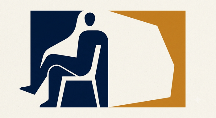
Whitespace is one of the most powerful tools in minimalist graphics design, but only when it’s used strategically. Random gaps between elements don’t improve readability—they simply create inconsistency.
The goal is using negative space in graphics to separate related information, improve focus, and create breathing room around key elements. When spacing is intentional, viewers can process information faster and understand the visual hierarchy more easily.
How to Fix It
Maintain consistent margins, padding, and alignment throughout the layout. Think of whitespace as an active design element rather than empty background.
Mistake 4: Choosing Style Over Function
Minimal designs sometimes prioritize aesthetics so heavily that usability suffers. Tiny fonts, low-contrast colors, or hidden navigation may look elegant but often frustrate users.
An effective minimalist graphics design always balances beauty with functionality. Visitors should never struggle to read text, identify buttons, or understand the purpose of a page.
If your project includes digital products or websites, learning practical UI/UX secrets can help you create experiences that are both visually appealing and conversion-focused.
Build Designs That Stay Simple—and Effective
Every successful minimalist graphics design starts with clarity. Rather than removing elements for the sake of appearance, simplify with purpose. When every design decision supports communication, your visuals become easier to understand, more memorable, and more effective.
Mistake 5: Overlooking Typography Consistency
Typography plays a larger role in minimalist graphics design than in many other design styles because there are fewer visual elements competing for attention. Inconsistent font choices, irregular spacing, or poor alignment can quickly make a polished layout feel unprofessional.
Limit your design to one or two complementary typefaces and establish clear rules for headings, subheadings, and body text. Consistency creates rhythm and helps readers absorb information without unnecessary distractions.
Another common issue is minimalism graphic mistakes involving font sizes that are too small to read comfortably. While subtle typography may appear elegant, usability should always come first.
How to Fix It
Create a typography system before starting your project. Define font families, weights, sizes, and spacing so every design follows the same visual language.
Mistake 6: Forgetting Brand Identity
A minimalist style should simplify your brand—not erase its personality. Some businesses reduce their visual identity so much that every design begins to look generic.
Your colors, typography, imagery, and messaging should remain recognizable across every platform. Minimalism works best when it enhances a unique identity rather than replacing it.
As modern aesthetics continue to evolve, many brands are embracing neo-minimalism graphics to combine clean layouts with bold accents, expressive typography, and stronger visual storytelling.
How to Fix It
Keep your brand guidelines consistent while simplifying execution. Even a restrained design should instantly remind audiences who you are.
Mistake 7: Trying to Do Everything Yourself
Maintaining a consistent minimalist graphics design across websites, marketing campaigns, presentations, social media, and advertising requires time, planning, and professional expertise.
As creative demands grow, businesses often find it difficult to keep every design aligned with their branding while meeting tight deadlines. Working with a dependable graphics design service can help maintain consistency without slowing down your marketing efforts.
If your company regularly needs creative assets, an unlimited graphic design subscription offers an efficient way to receive ongoing professional designs while keeping production predictable.
How to Fix It
Develop repeatable design standards and collaborate with experienced designers who understand your brand’s long-term vision.
Building Better Minimalist Graphics Design
Great minimalist graphics design isn’t about removing every visual element—it’s about ensuring that every remaining element serves a purpose. Strong layouts communicate quickly, reduce distractions, and guide viewers naturally toward the information that matters most.
A thoughtful approach to spacing, typography, hierarchy, and branding creates visuals that are memorable without feeling cluttered. Instead of chasing trends, focus on timeless principles that improve communication and user experience.
Budget planning is another important consideration for growing businesses. Understanding the typical graphic design cost helps you compare solutions that balance affordability with consistent creative quality.
Whether you’re creating marketing materials, redesigning a website, or refreshing your brand, investing in better design processes leads to stronger results over time.
Conclusion
Successful minimalist graphics design is built on intention, not limitation. Every choice—from spacing and typography to hierarchy and branding—should support a clear objective.
By avoiding these seven common mistakes, you’ll create visuals that are cleaner, easier to understand, and more effective at communicating your message. Minimalism isn’t about making designs look empty; it’s about giving every element a meaningful role.
As your business grows, maintaining consistency becomes just as important as creating beautiful visuals. With the right design strategy and professional support, minimalist design can become a powerful asset that strengthens your brand across every customer touchpoint.
Frequently Asked Questions
1. What is minimalist graphics design?
It is a design approach that removes unnecessary elements while emphasizing clarity, functionality, and visual balance.
2. Why is negative space important in minimalist design?
Negative space improves readability, directs attention, and creates better visual hierarchy.
3. Can minimalist design improve conversions?
Yes, cleaner layouts reduce distractions and help users focus on important actions.
4. How many fonts should a minimalist design use?
Most projects work best with one or two complementary typefaces.
5. Is minimalist design suitable for every business?
Yes, when adapted to reflect a brand’s unique identity and audience expectations.